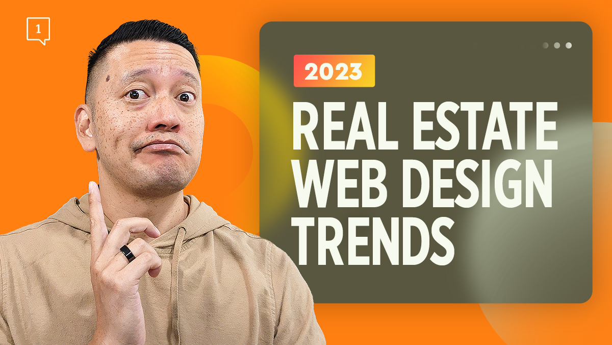
2023 Web Design Trends for Real Estate Agents
- Post author By Emmanuel Lao
- Post date 12/29/2022
- No Comments on 2023 Web Design Trends for Real Estate Agents

Table of Contents
Are you planning to rebrand your existing real estate website or you’re planning to launch a new one this 2023?
My business creates great real estate web design, along with real estate strategies to help realtors scale their businesses. As a web developer and realtor, I’ve kept my finger on the pulse of what realtors need for their websites to attract leads and convert them to clients. I’ve broken down what I believe to be the biggest User Interface trends for 2023.
But before I get into it, I want to preface this by saying that I am not going to be reviewing actual real estate websites, because, the reality is, most real estate website’s just don’t look very good.
So this list is an ode to you if you’re trying to break the crappy real estate web design cycle.

YOUR WEBSITE ISN'T GENERATING ANY LEADS BUT WE HAVE A SOLUTION
In this free 20 minute video training you'll discover:
- 3 key secrets to restructuring your real estate business for growth
- Understanding the strategy of specialization
- A new approach to positioning yourself in real estate
- How to address your messaging to properly acquire prospects
Whenever you are ready, click the RED button below that says "Grab my training now"
2023 Web Design Trends
I’ve looked at web design trends globally, and across multiple industries to look for what I’m predicting to be the cool new thing for 2023
#1 Animated Product Reveals
These are hover animations to keep users passively engaged. In layman’s terms, it’s what happens when you click on something that triggers cool animations before it takes you to where you want to go. It adds a bit of flare to the design. There is a growing trend to add it over thumbnails so that when you click, they create an animation to entertain you while loading the next page.
As it pertains to your real estate website I definitely see this adding a bit more luxury to your interface if someone is trying to navigate to view your properties for example.
That extra little bit of visual flare adds some additional class and snap to your website.
#2 Nostalgia And The Y2K Aesthetic
Think back to websites of the 2000s. They were very minimalistic. Since the internet just wasn’t as fast back then, websites tended to be more text-heavy with a lot of white space. A mixed-use of bold and regular fonts dictates where the eyes should go.
Another thing to look out for when we’re talking about old design is the pixelation of icons and elements. The simple shapes give a really retro look if executed correctly.
#3 Customizable Viewing Experiences
I’m sure you’ve noticed on your phone or laptop that either your screen changes color depending on the time of day or you have a toggle from light mode to dark mode on some apps like your Kindle. Well, this trend is catching on when it comes to website design.
In real estate, one of the big things when it comes to your website is ADA compliance to make sure your website is accessible for those with disabilities. Adding a mode to invert colors adds another layer to design, not only for accessibility to disabled website visitors but aesthetically as well.
#4 Scrapbook Aesthetic
Most real estate websites tend to look very templated because of a very boxy layout so this design trend tries its best to remove the template feel. It focuses more on adding background elements like doodles and hand lettering to make it look a little bit more like a scrapbook or journal. Now, this is pretty cool because it breaks the monotony of the traditional style of website and simple elements like images of torn paper are very easy to do and pay dividends in terms of making your website look different.
#5 Overlapping Text
In the same vein of trying to not look like a templated website, having elements overlapping with each other breaks the traditional frame of a website layout. It’s subtle but it also makes you look a lot different.
#6 Overstimulation
Think of this as a very in-your-face design. It’s the opposite of minimalist but just as simple if not simpler. This trend pretty much says down with white space and makes your website look like an Apple website. Imagine the opposite of having any white on your website, meaning full-screen video and oversized typography.
LEARN HOW WE’VE GENERATED OVER 100,000 LEADS FOR OUR REAL ESTATE CLIENTS LAST YEAR
Marketing Strategy – create inbound strategies to better position you for the long game.
Systems Implementation – we design and implement systems for you to buy back your time.
Brand Building – position you as the thought leader and authority in your community.
Final Thoughts
As you go through the process of revamping or creating your website, remember that your website is about your leads and potential clients. It’s not about what you think is important and you end up stuffing the website with a lot of things that they probably wouldn’t need. Focusing on the user experience ensures that leads and potential clients stay on your website and are able to consume all the information there.
That being said, your real estate website is your online business card and can help make or break your initial interaction with your clients.
Looking for more real estate strategies to grow your business? Join our free Square 1 Facebook Group for similar content that can help you in your Real Estate journey. If you are interested in one-on-one coaching, then schedule a strategy session with me today, and let’s talk about how I can help you move your business forward.


